
INTRODUCTION
Role
Product Designer
Tools
Figma, Optimal Sort, Maze
Timeline
2 months
01
Overview
BACKGROUND
In urban areas, frequent moves driven by fluctuating rent add significant stress to daily life. Many compare the experience to a breakup or divorce, with packing and downsizing cited as the most overwhelming parts.
PROBLEM
The moving process can be extremely stressful and overwhelming.
GOAL
We want to understand what adults struggle with the most when searching for services they need during their move. With this knowledge, we can provide a seamless experience that will reduce stress levels.
02
Discover
RESEARCH PLAN
A few things we’ll need to figure out first...
Learn what users look for and prioritize while moving
Determine what methods/resources users currently use & their experience with it
Understand how users feel while moving & what causes them to feel th way they do
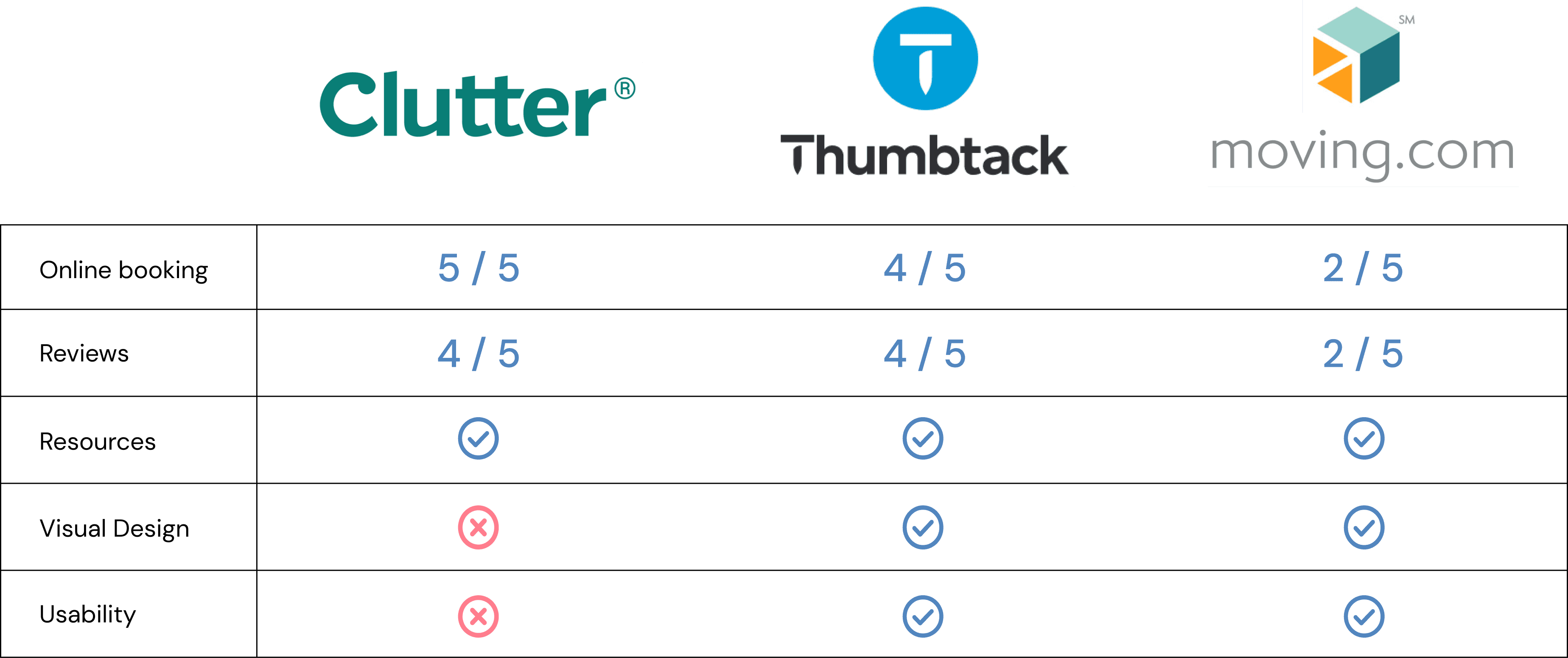
COMPETITICE ANALYSIS
We accessed three popular websites that cater to services related to moving. Although they all have their strengths, there wasn’t one that had both the visuals and usability that would create a seamless experience.
USER RESEARCH

One on one interviews were conducted in order to learn about users’ frustrations & needs. Participants ages ranged from 25-60 and have moved within the past 2 years.
Some of our findings:
Most participants had help from friends & family
100% expressed importance of price & good reviews
100% preferred the convenience of searching online but few mentioned contacting a business directly
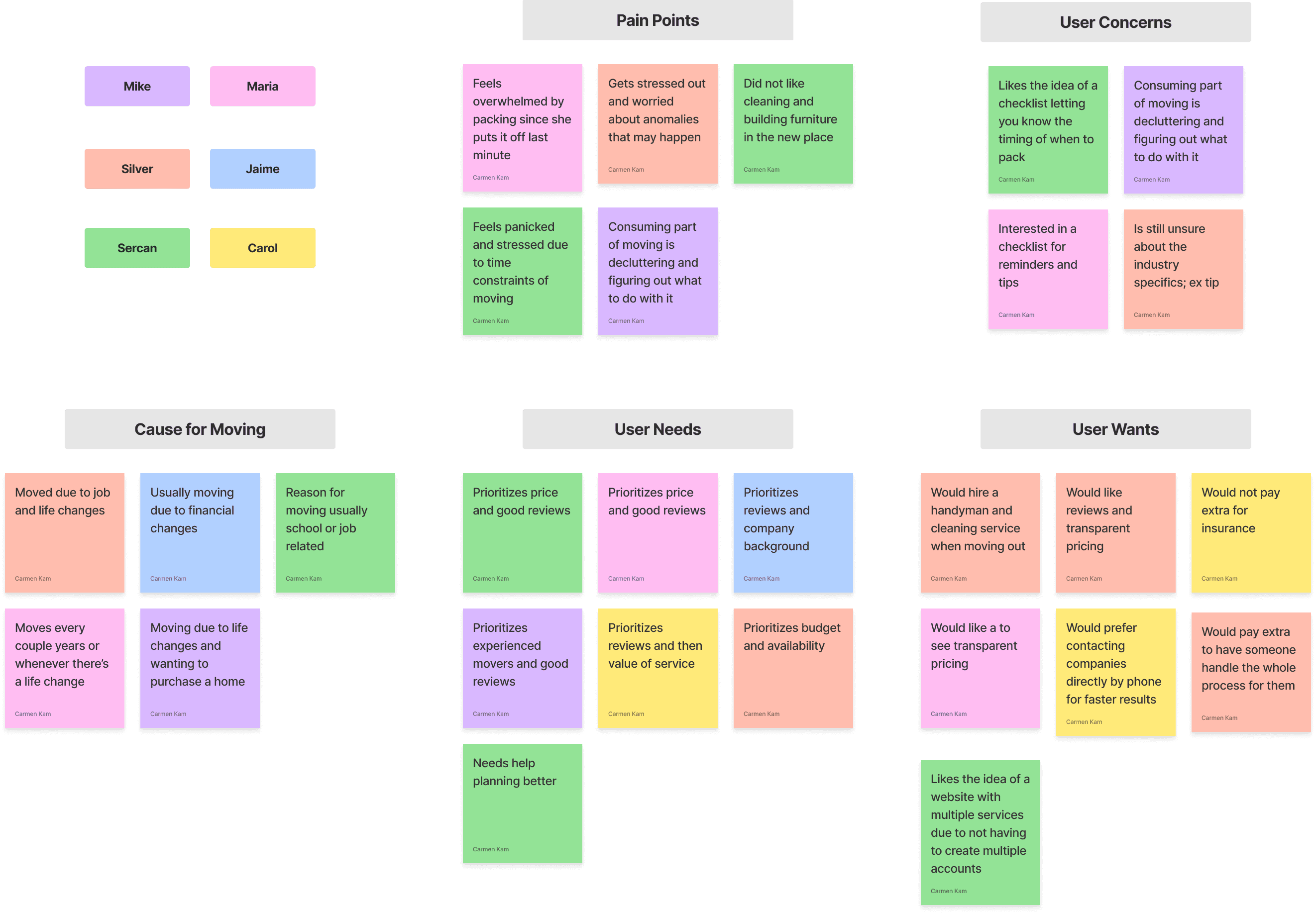
After finding the participants’ common pain points & needs, a clearer picture forms in who will be using this platform.
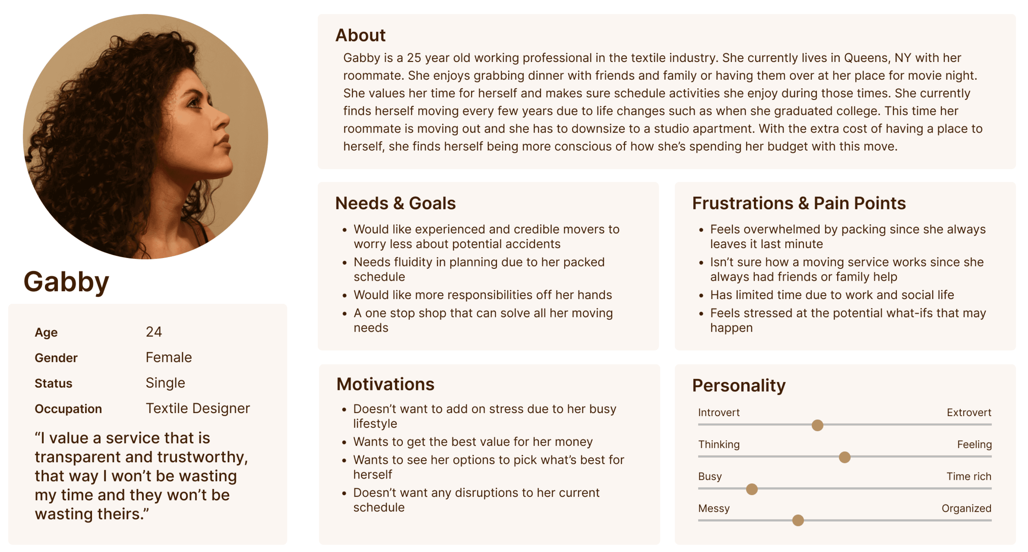
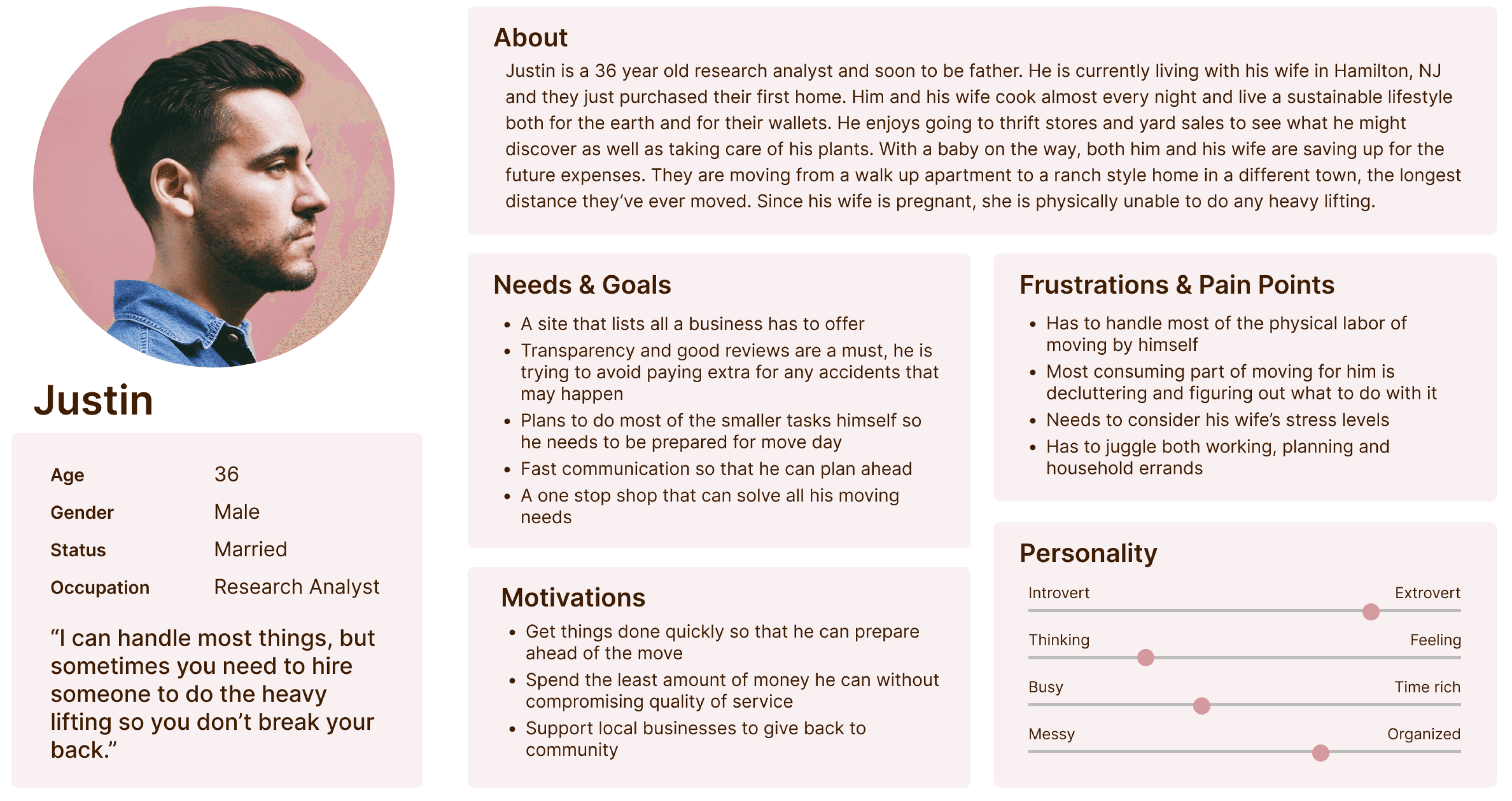
How might we assist movers who feel overwhelmed and stressed to instill more confidence in their moving process?
03
Ideate
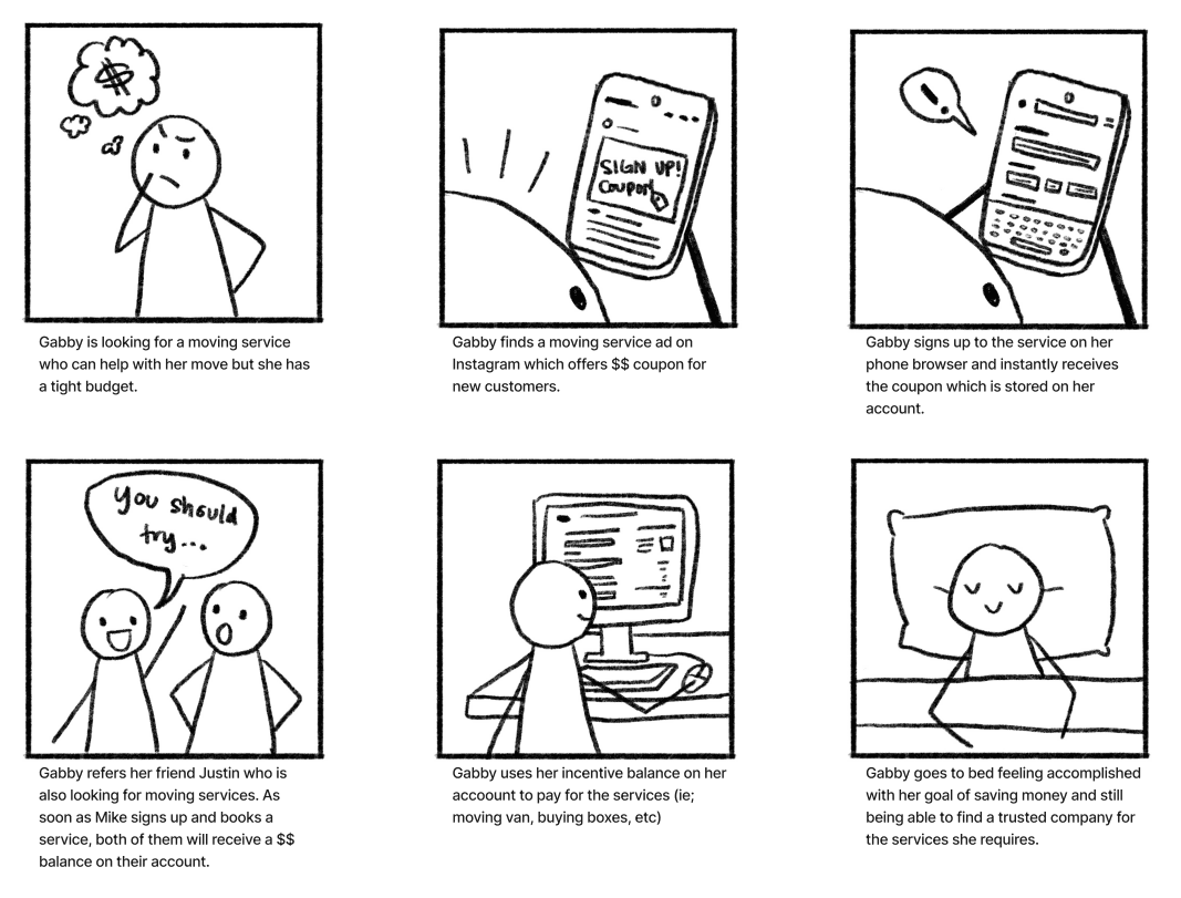
STORYBOARD
Scenarios were crafted to walk in the users’ shoes. Allowing us to understand what they are looking for.

TASK & USER FLOWS
User flows helped translate our users’ needs & goals into steps inside of the product.
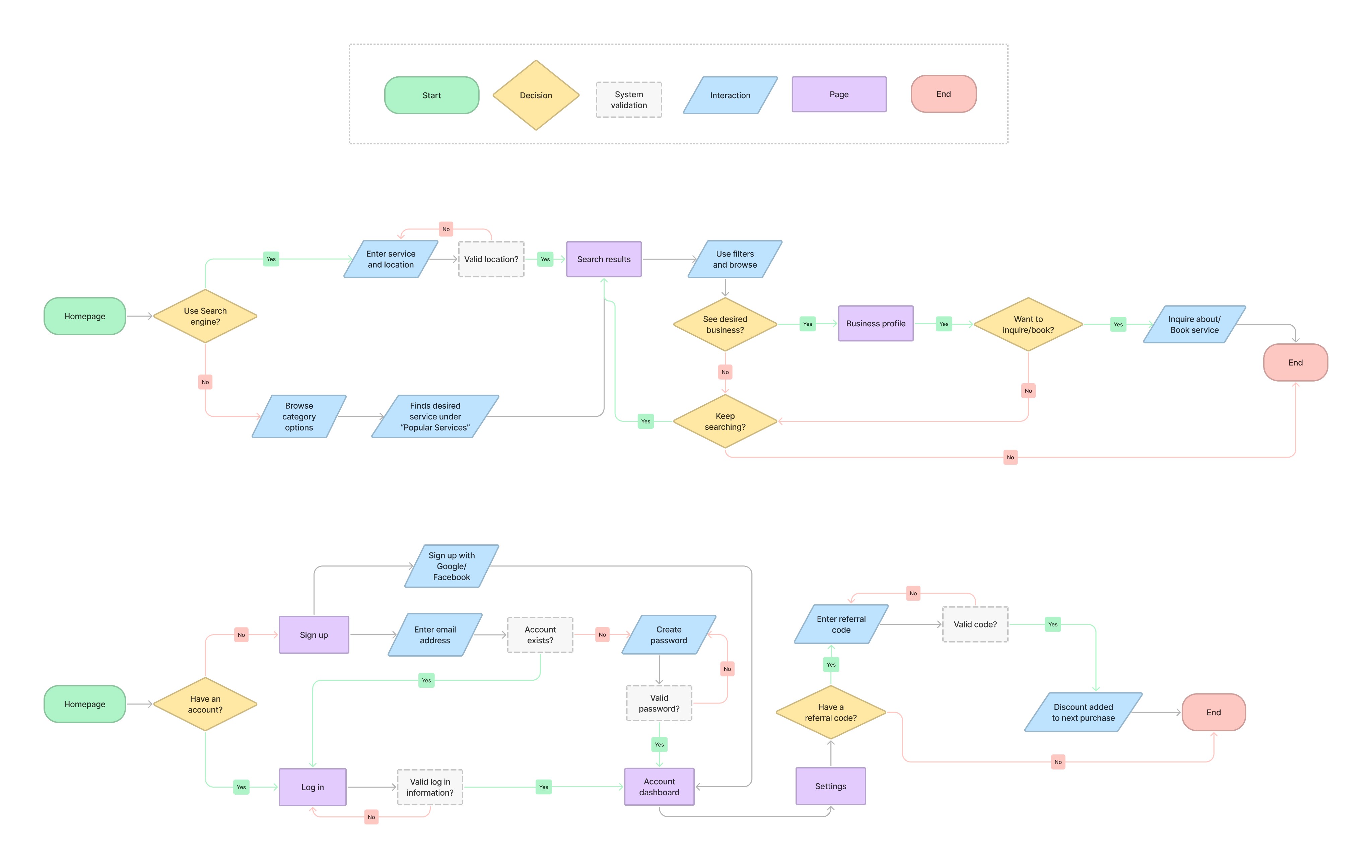
Task flows formed the structure of the product by creating a direct path to our users’ goals. This prioritizes the key screens needed to start wireframing.

04
Design
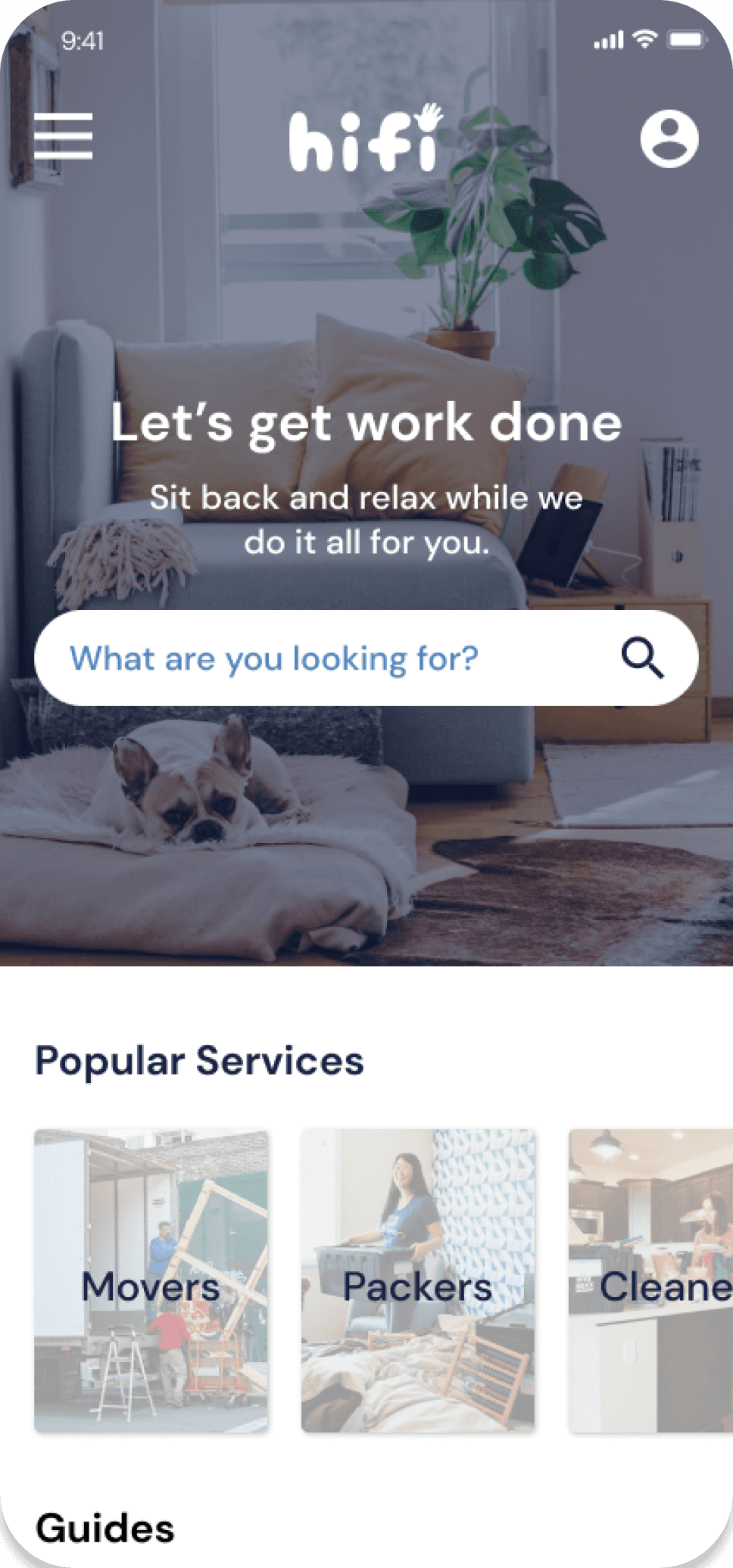
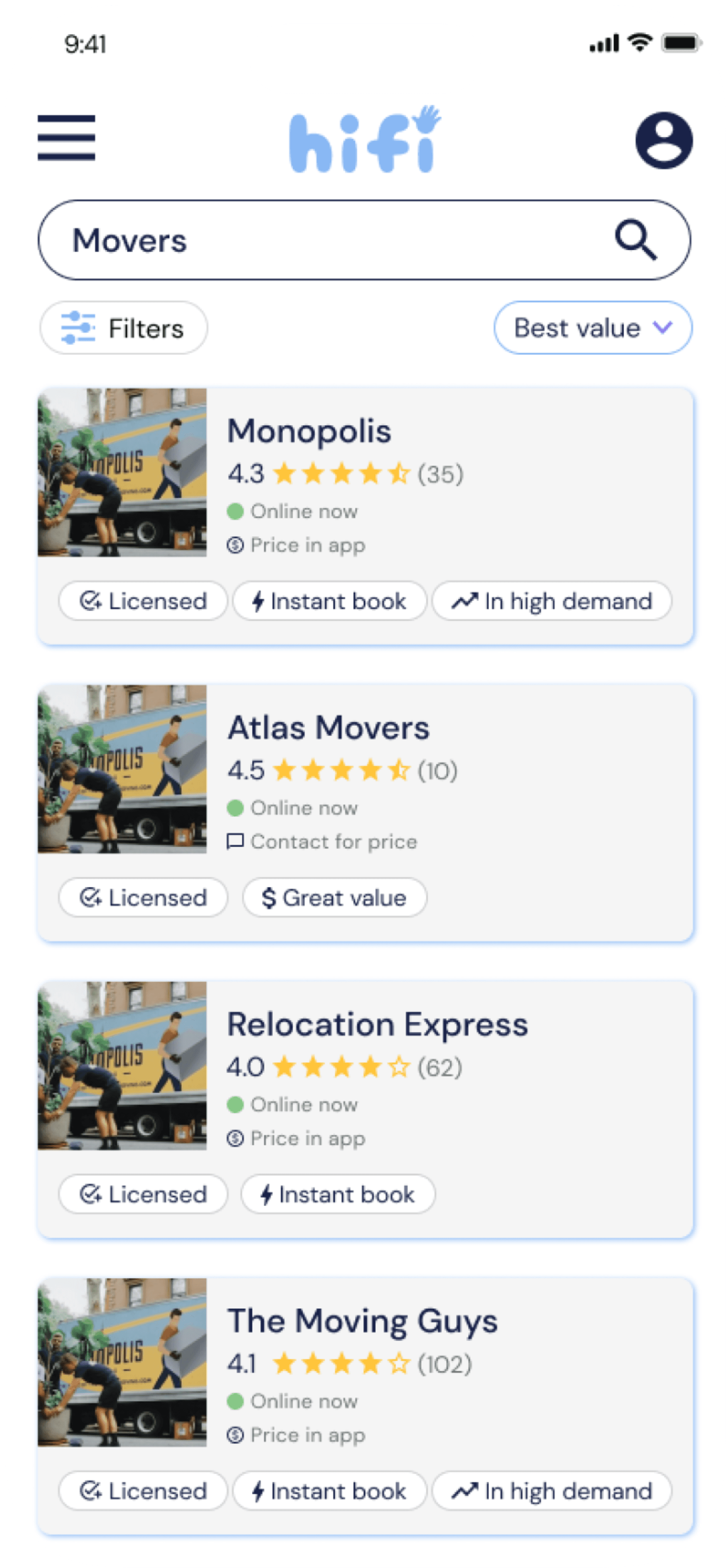
MID FIDELITY SCREENS
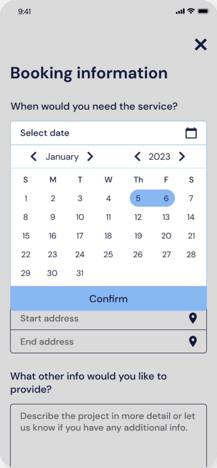
We digitized initial concepts for key screens extrapolated from the user task flows for signing up & booking a service.

BRANDING & UI DESIGN
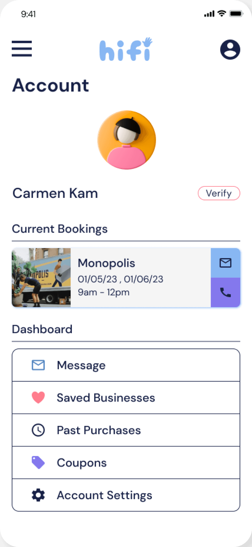
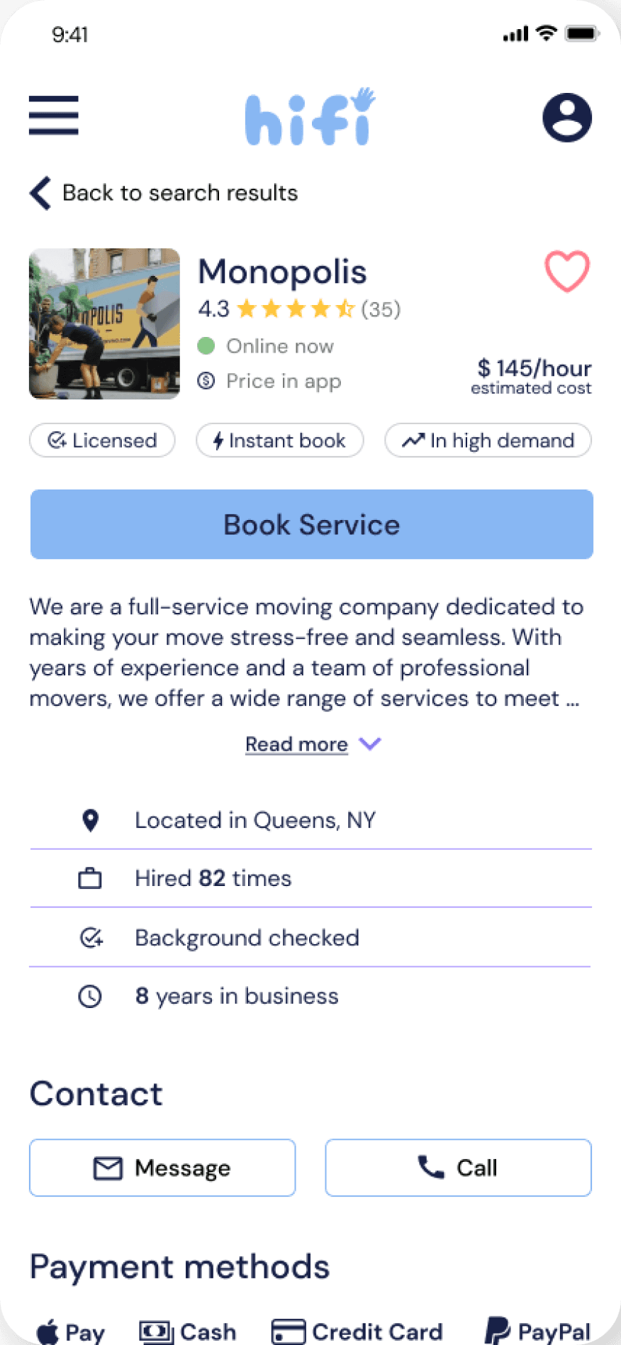
“Hifi” has a youthful fun vibe with its bright saturated tones. The blue instills trust, yet calms the eyes. While purple, often used for royalty in the past, exudes an air of confidence. THe typeface chosen is clean & comfortable on the eyes.


One of the keywords for ‘hifi’ is being insightful & transparent. This inspires the minimal no fuss look that the UI design embodies. Round corners & solids colors ease the journey the user will go through.
05
Test
USABILITY TESTING
Testing was conducted unmoderated on Maze with participants between ages 20-40. Our goal is to determin e if users are ablet to navigate the website intuitively. This is also a chance to confirm that the interface is overall friendly & easy to use.
INTERATIONS
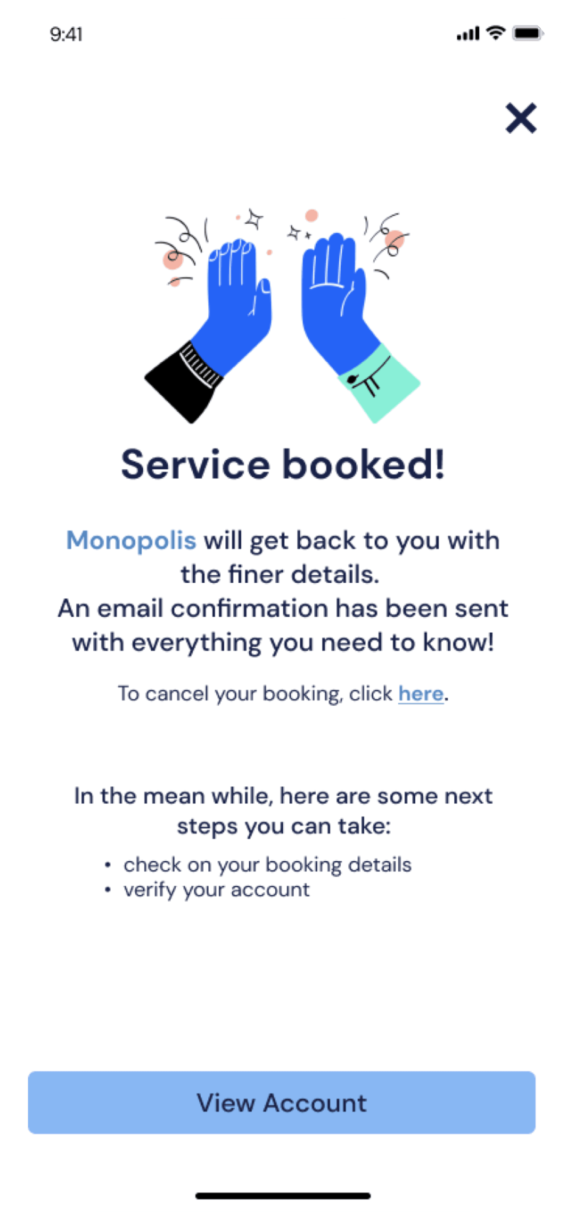
Iteration #1: SIgn up confirmation


Iteration #2: Business tags
Iteration #3: Booking confirmation exit